Supplier Analytics — see which suppliers are growing, which are slipping, and how good a partner each one really is
If you buy from more than a handful of suppliers, "how is supplier X doing?" is a question that costs you 20–40 minutes of exporting purchase orders and sales orders into a spreadsheet — and "which supplier grew the most this year, and which one is quietly slipping?" usually never gets asked at all. The data already lives in SKU: every PO, every receipt, every sale and its margin. It's just scattered. Supplier Analytics pulls it together into one decision-making surface: a macro dashboard that ranks your entire supplier base, a weighted performance scorecard on every supplier, and a per-supplier breakdown of which products are driving — or dragging — the relationship.
✨ What this means for you:
- A macro dashboard that ranks every supplier by growth, purchase volume, sales volume, and profit — sortable, on one screen.
- Hottest and Coldest Suppliers surfaced automatically, with a minimum-volume guard so a one-PO supplier can't top the list.
- A performance scorecard on every supplier — a single 1–5 score built from on-time delivery, lead-time reliability, fill rate, defect rate, and cost competitiveness, always expandable to its components.
- A per-supplier Analytics tab with KPIs, trend charts, hottest and coldest products, and a full product-by-product breakdown.
- YoY / QoQ / MoM / custom period comparison applied consistently across every metric.
A macro view of your whole supplier base
Open Insights → Supplier Analytics for the portfolio view. KPI cards across the top show total purchase volume, sales volume, profit, and active suppliers — each against the prior period with a signed delta. Below them, Hottest and Coldest Suppliers call out the biggest movers automatically, and a Growth Heatmap plots every supplier against time so a cooling relationship shows up as a row turning red months before a stockout or a quality incident forces it onto your radar.
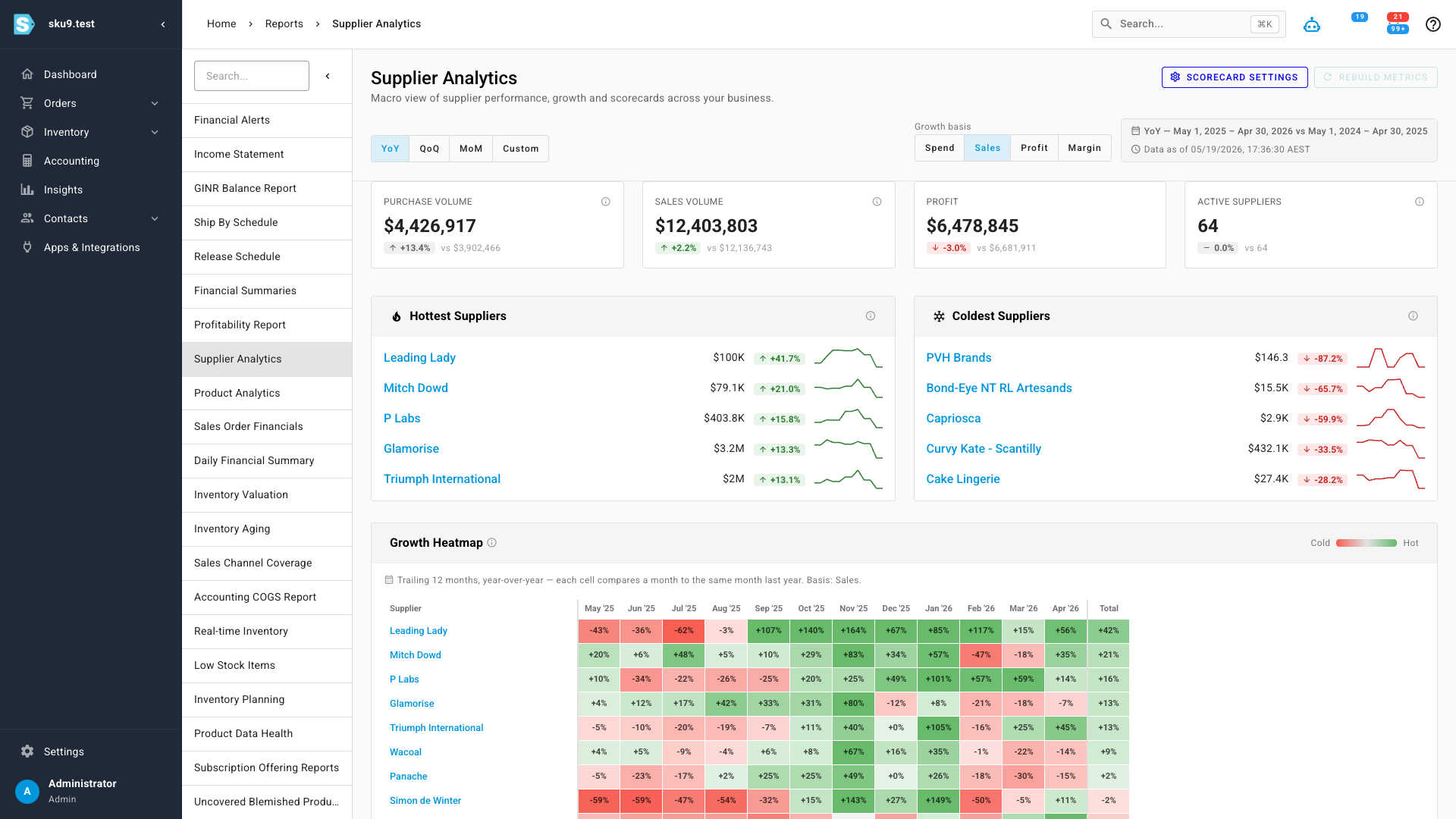
The period toggle (YoY, QoQ, MoM, Custom) and the growth basis (Spend, Sales, Profit, Margin) re-frame the whole dashboard at once — so you can ask "who grew the most this quarter by profit" without touching a spreadsheet.
Rank every supplier side by side
A sortable Supplier Leaderboard ranks every active supplier with its purchase volume, sales volume, units purchased and sold, profit, margin, growth, scorecard score, and active PO count — each with its own delta badge. It's the cross-supplier comparison that used to mean a manual export: the renegotiation candidate, the supplier you should be buying harder from, the one to consolidate away, all visible at a glance.
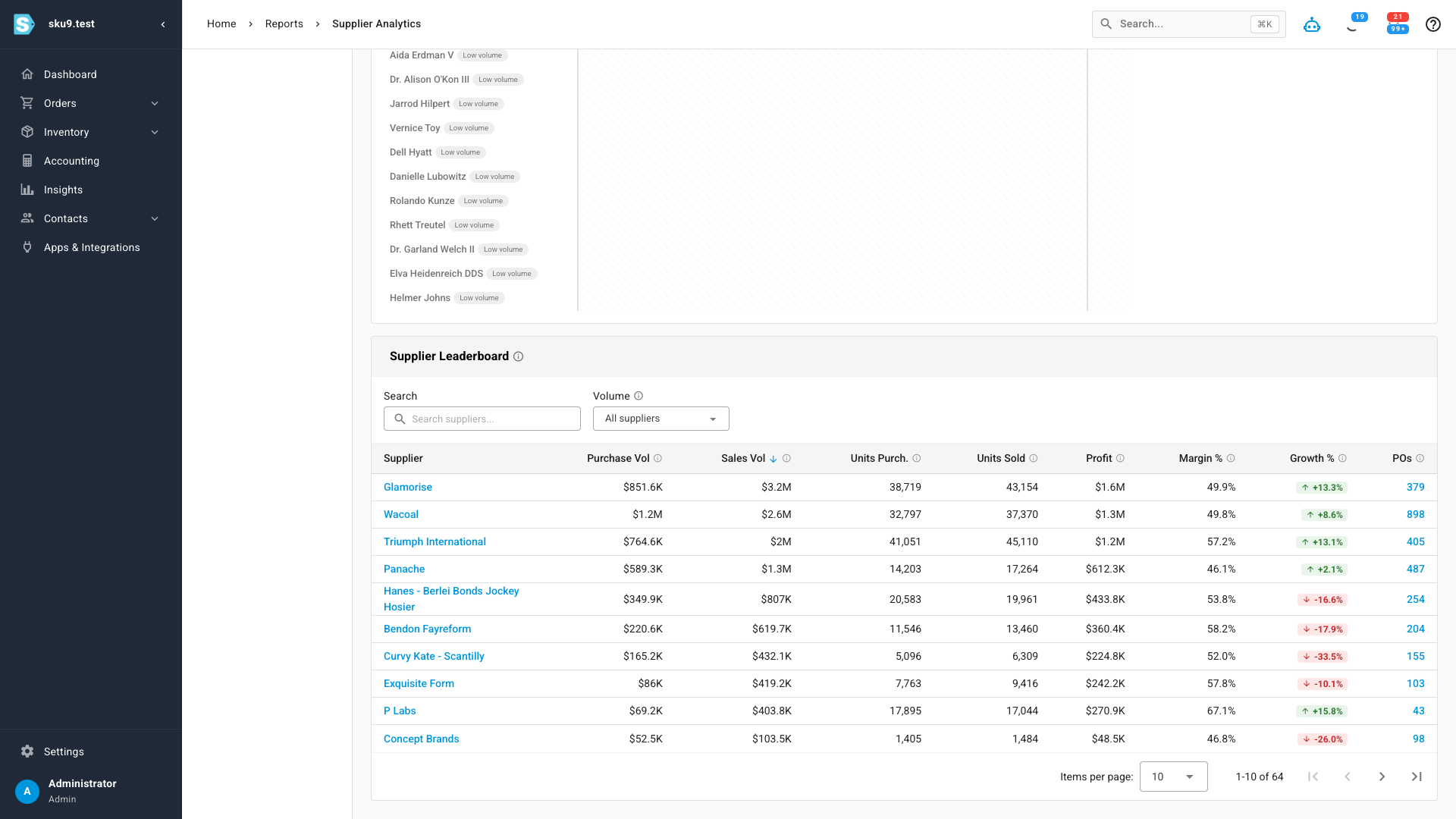
Click any supplier — in the leaderboard, the heatmap, or the movers panels — to drop straight into its own analytics view.
A scorecard for every supplier
Every supplier gets an Analytics tab on its detail page. It opens with that supplier's KPIs, a trend chart you can switch between spend, sales, units, profit, and margin — and the Supplier Scorecard: a single 1–5 score that distills delivery, quality, cost, and responsiveness into one signal, with a radar chart breaking out each dimension so you can always see which part is strong or weak. Below it, hottest and coolest products and a full product breakdown table show exactly which SKUs are driving the relationship.
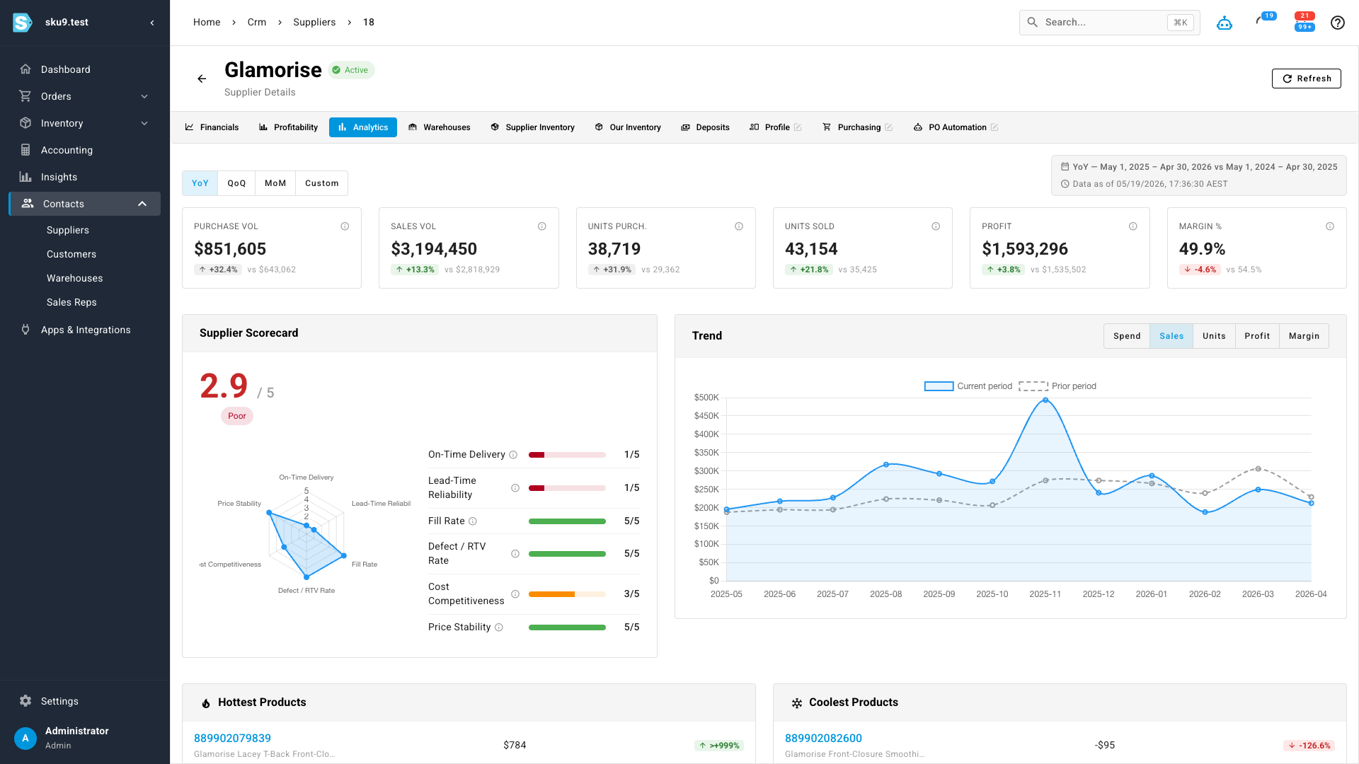
A supplier with too few purchase orders in the period shows "insufficient data" instead of a misleading score.
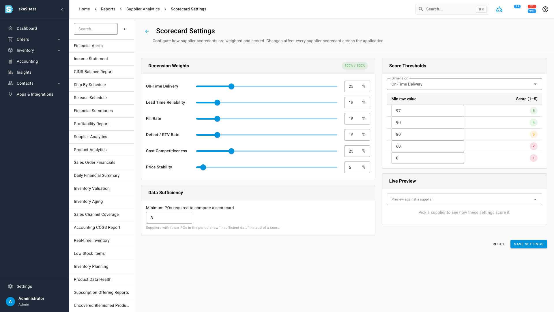
Tune the scorecard to your business
The composite score isn't a black box. Scorecard Settings lets you set the weight of each dimension — on-time delivery, lead-time reliability, fill rate, defect rate, cost competitiveness, price stability — and the raw-value thresholds that map to each 1–5 band. A distributor competing on landed cost and a seller who lives and dies by delivery reliability can each tune the score to mean what it should for them. There's also a minimum-orders threshold so low-sample suppliers don't get a score off two POs, and a live preview so you can see the effect of a change before you save it.
Where to find it
Open Insights → Supplier Analytics for the macro dashboard, leaderboard, and movers. Every supplier's own numbers live on the Analytics tab of its detail page, and the scoring rules are under Scorecard Settings from the dashboard header.